Improving Canva Notifications
Timeline: 3 months | 2023 - 2024

Revamped Canva notifications for a cleaner and more functional experience with notification grouping to declutter and focus on important updates.
The opportunity.
User problem
As Canva’s user base continues to grow, notifications have increased by ~93% over the past year, with users receiving 10% more notifications on average. Despite this, only 15% of team users actively check their notification centre, and of those, 40% take action.
A key challenge is how notifications are delivered:
Each comment on a design triggers a separate notification, creating unnecessary noise.
The majority of comments receive no replies, meaning most notifications aren’t driving engagement.
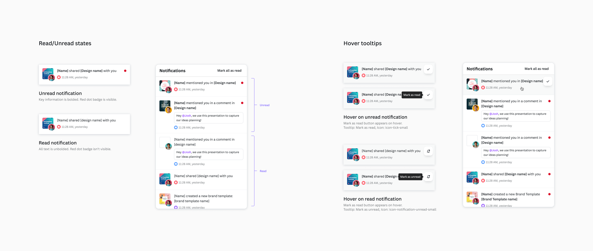
Users cannot mark individual notifications as read/unread — opening the notification centre automatically marks everything as read, leading to missed or forgotten updates.
As collaborative use of Canva grows, the volume of notifications will continue to rise. To keep notifications valuable and actionable, we needed to streamline how they are delivered.
Business strategy
To improve collaboration and engagement, we aimed to increase notification open and response rates while making notifications more useful and less overwhelming. This also presented an opportunity to improve the notification centre’s design, making it more intuitive, visually engaging, and aligned with modern design and collaboration tools.
Beyond improving the immediate experience, refining the read/unread behavior laid the groundwork for a future initiative aimed at streamlining team collaboration and feedback workflows, ensuring a more valuable experience.
The previous experience.
The solution.
Changes to improve the notification experience
Remove To Do and Completed tabs
The "To Do" and "Completed" framework didn’t align with Canva's notification types. Informational notifications, like "John Smith has shared a design with you," don’t require action, while actionable ones, like "John Smith has mentioned you," do. Applying this framework created confusion and didn’t meet user expectations or industry standards.
This framework is better suited to a task manager usecase. Trying to serve both it and a traditional notification center usecase results in neither being effective, as shown by only 0.5% of users marking notifications as complete in the previous experience. Simplifying the notification experience will improve usability and better meet user needs.
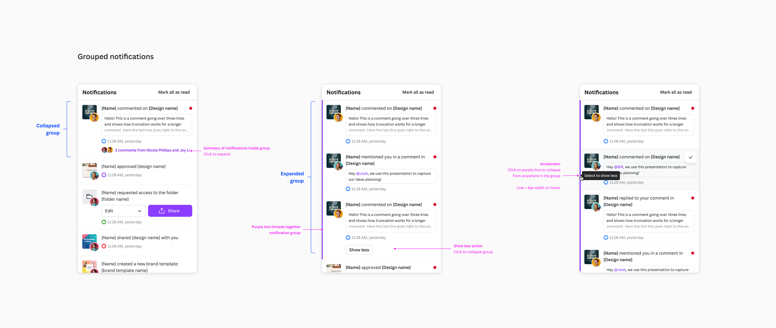
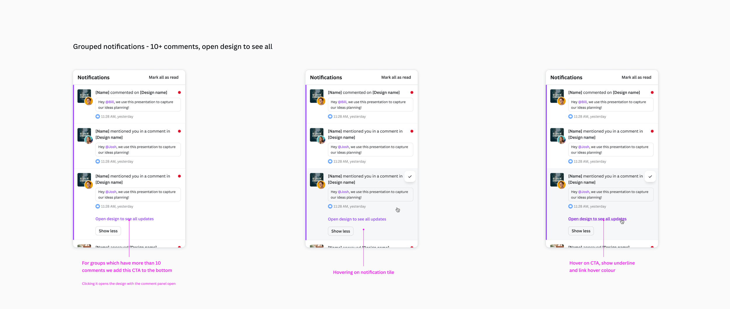
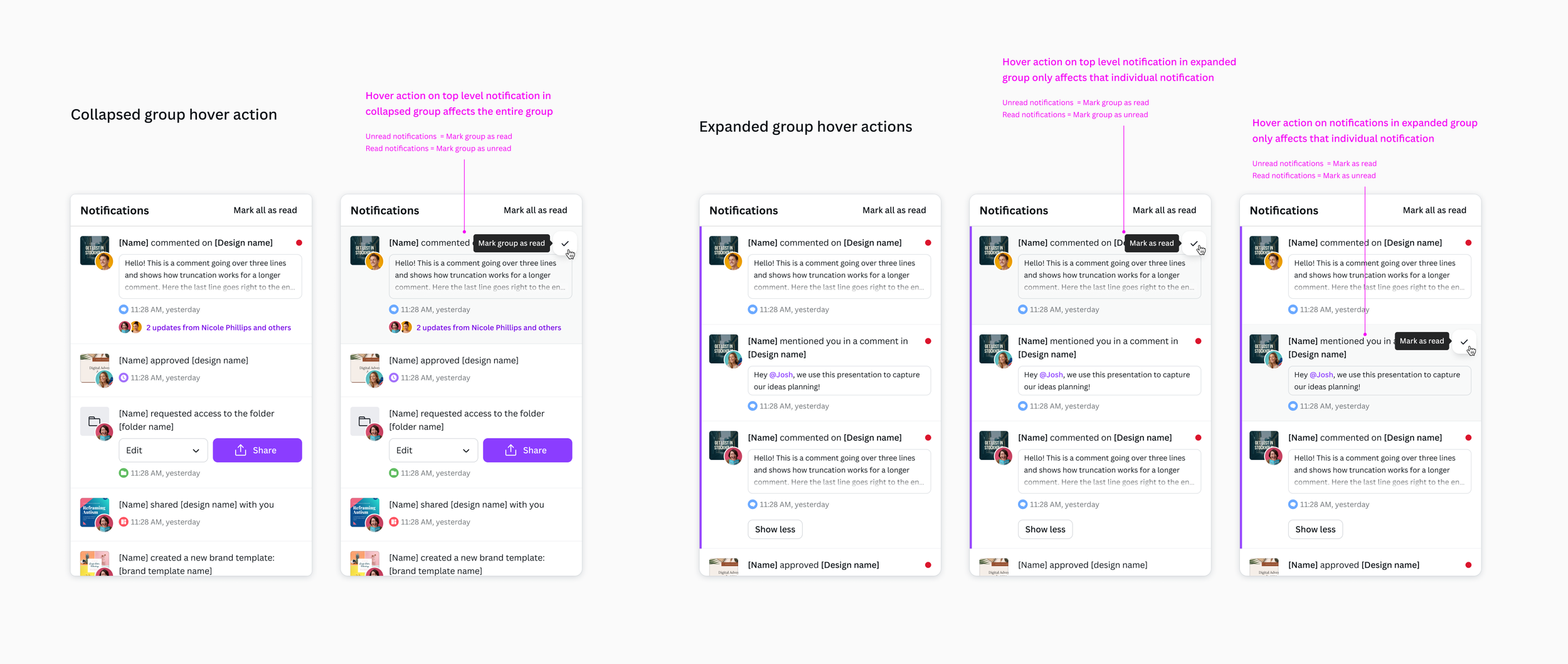
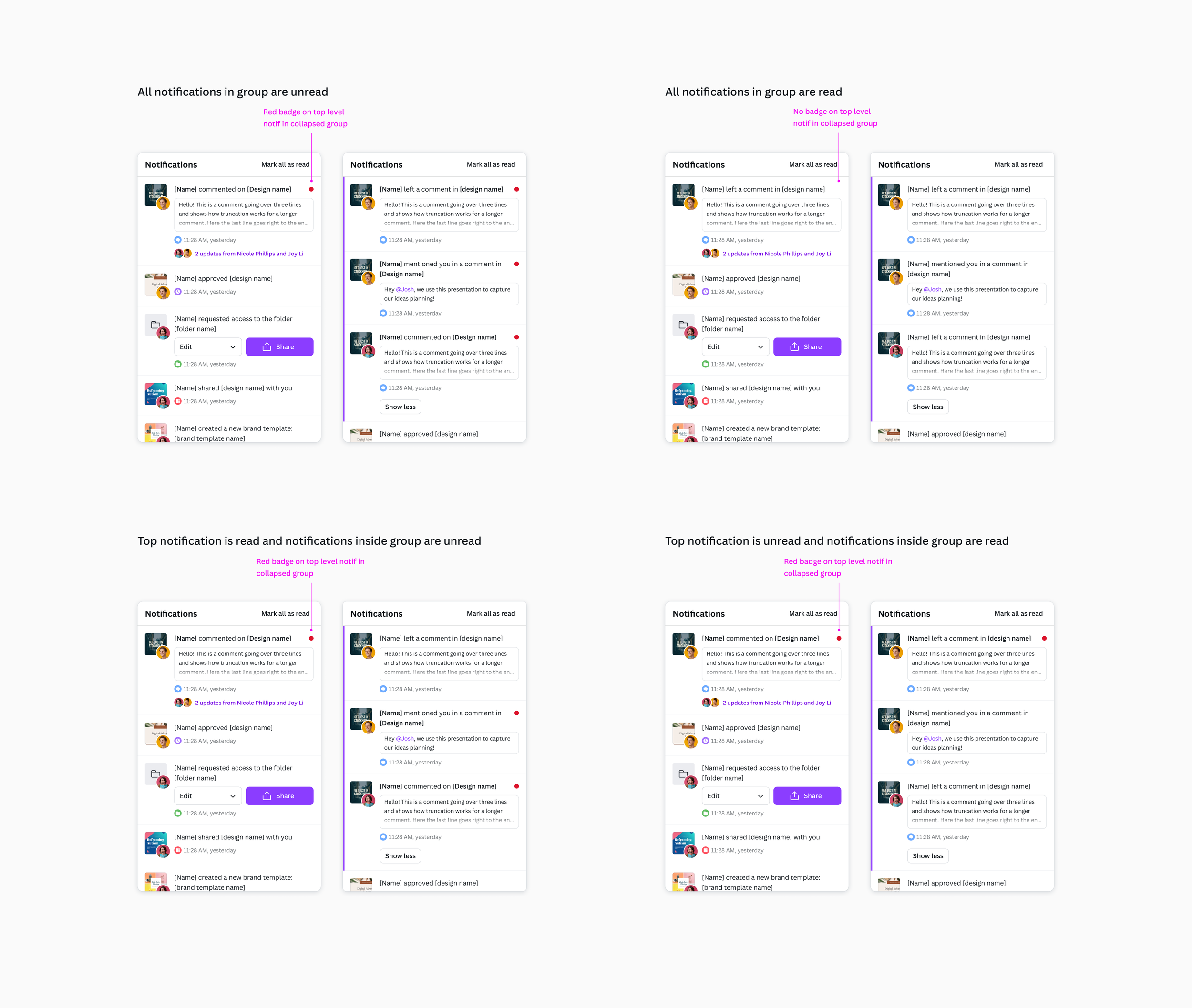
Introduce grouping for high volume notification types
Grouping high volume notifications, such as comments and suggested edits on the same design, will reduce notification noise and improve clarity. By collapsing multiple notifications into a single thread, users can easily follow ongoing discussions without missing other important updates amidst the noise.
Allow individual notifications to be marked as read by either opening the notification or manually marking it as read
The previous behavior, where all notifications are marked as read upon opening the notification centre, doesn't reflect user intent. It can lead to missed or forgotten updates, as users may open the centre to check one notification but inadvertently mark all of them as read.
Update checkboxes to buttons for actioning notifications
Previously, checkboxes were used to trigger actions, which creates confusion as checkboxes are typically associated with binary choices. This inconsistency can lead to usability and accessibility issues.
Replacing checkboxes with buttons on hover aligns the design with established UI patterns, such as those used in the commenting experience. Additionally, removing unnecessary elements like checkboxes creates a cleaner, more visually appealing notification centre.
The impact.
This project significantly improved the usability and effectiveness of Canva’s notification centre, making notifications more actionable, reducing noise, and enhancing the overall user experience. Key outcomes include:
225% increase in users engaging with notifications, improving visibility of important updates.
A refined and visually cohesive notification center that is more intuitive and easier to use.
Reduced notification overload through grouping and improved read/unread behavior, making it easier to track updates.
By refining the notification experience, it is now easier for users to stay informed and act on important updates, ultimately driving better engagement and collaboration within Canva.